Translated a complex spatial modelling process for land use planning into an interactive article using visual storytelling and data visualization. (2020)
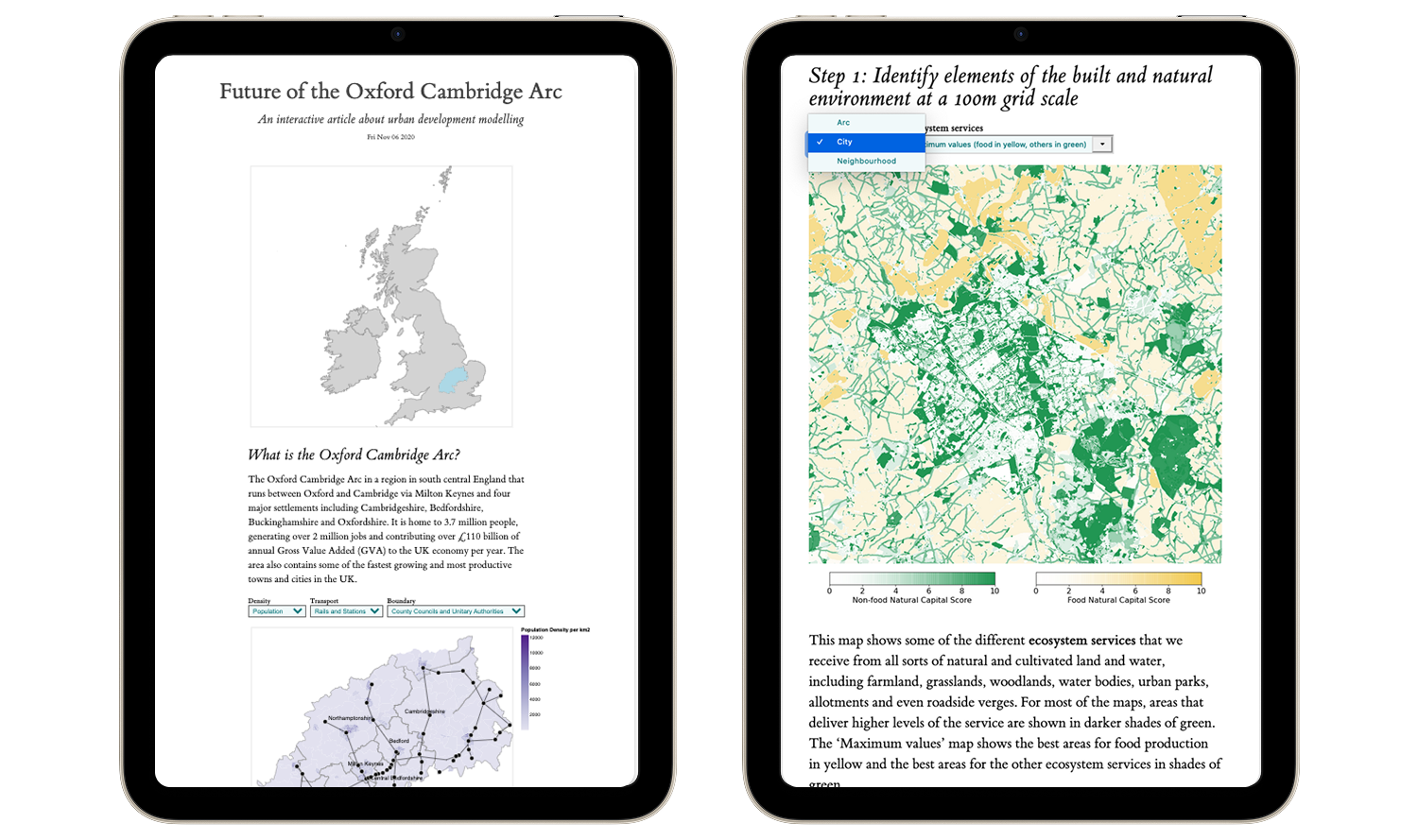
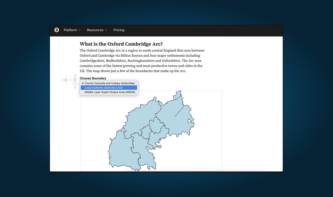
The Oxford Cambridge Arc contained some of the fastest growing towns and cities in the UK and the government had released plans to include 1 million new homes by 2050, a new expressway road, and additional rail routes. As part of the planning process for the Arc area, a consortium of UK universities applied the world’s first national infrastructure 'system-of-systems' modelling software to simulate infrastructure change. Prior to the Arc, the model was applied at the national level of Britain and the Arc was the first use case at a regional scale. I was contracted by the University of Oxford, one of the consortium of universities leading this project, to create a visualization that communicated the process and early results of what the team had completed.
My goal was to design and develop a visualization about the spatial analysis options and futures for the Oxford-Cambridge Arc. It should communicate the process and early results of what the team had completed. It should also showcase the value of urban spatial modelling to a broader non-technical audience.
The challenge was that there were many lengthy parts to the model and assessment methodology and the project was still wrapping up. It was a complex process that would be difficult to explain in a simple way.
Throughout the project, I worked with a research software developer on the MISTRAL team (Tom Russell) and was given access to the team’s datasets and guided through the details of their research. I'd be doing more technical work compared to my past projects, working with various geographic file formats and programming. Early on, I proposed a format of an interactive article that would emphasize storytelling while allowing non-technical viewers to interact directly with the data themselves. My contributions were divided into three main stages: Drafting the outline of the visualization, designing static or interactive visuals, implementing the final visualization. Credit goes to Tom on preparing the final GIS outputs.
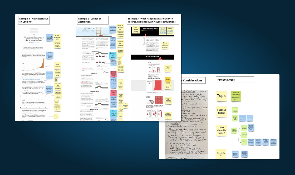
Background reading and synthesis. As part of my research, I dissected a few interactive articles to try to find some common patterns.
Low-fidelity outline of the overall story. I tried to strike a balance of presenting information in a simplified way for non-technical audiences, while accurately representing the key aspects of the process to not oversimplify.
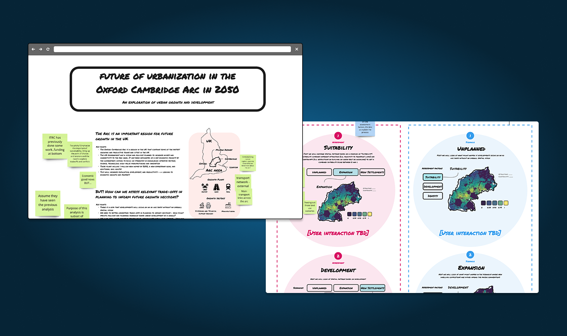
Mid-fidelity mockup. Moving to higher fidelity allowed the team to scroll through the article in a more realistic way.
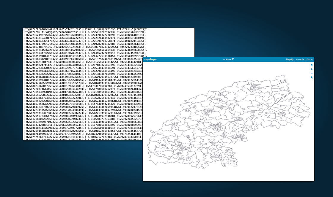
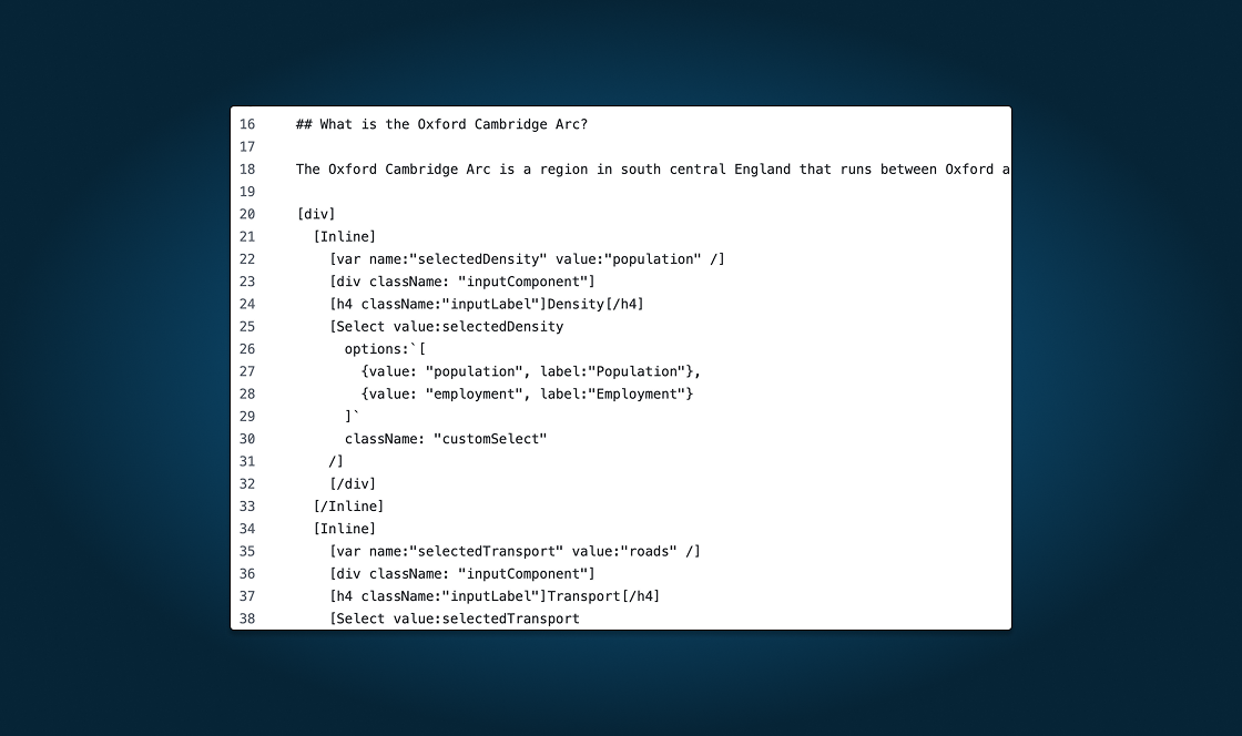
Gathering and plotting data. Once the team was able to share their datasets with me, I converted geographic files into other formats including GeoJSON and an extension of GeoJSON called TopoJson. Then I used Observable to plot the data.
Interactive prototyping (View live prototype.) Observable allowed me to see visuals alongside the code right away without getting stuck in errors.
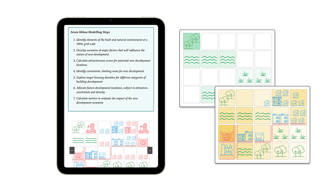
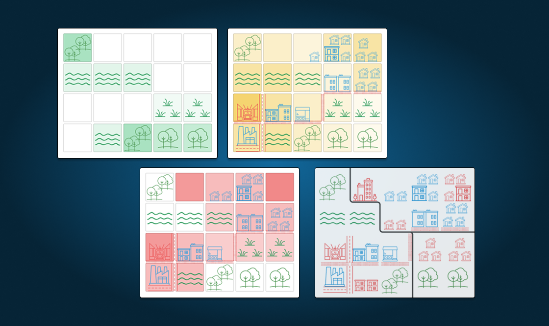
Creating visual assets. There were some grid-like static images that I created to show the steps of the spatial analysis process.
Development (using Idyll.) Idyll is a very “high-level” language, building off of other JavaScript libraries and so it hides a lot of the technical details under the hood. This made it easy to start, but hard to do anything more custom. With a decent working outline in Observable, I eventually ported the Observable file back to Idyll.
Because greenhouse gas reporting only happens once a year, it was easy to forget how the software worked. Having to relearn the same steps every year felt frustrating. Having access to updated manuals and human support was key to helping users get back up to speed.
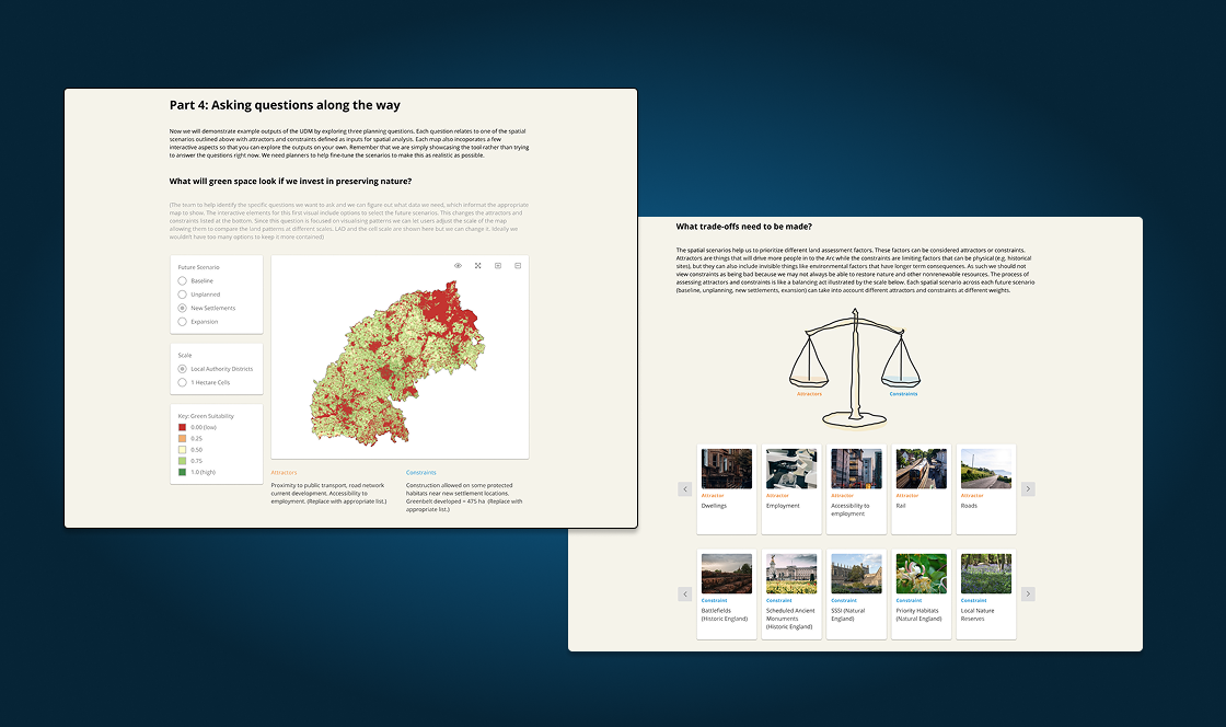
Plans for land development are often controversial. Different stakeholders have varying interests in how housing and other development should take place. The MISTRAL team wanted to showcase their approach to practitioners, local authorities, academics, and other stakeholders with a land use interest/problem. Rather than steering toward any one stakeholder's agenda, the article was designed so that different groups could apply the model to their own use case. After providing context on what the Arc area is and four future scenarios, I focused on explaining seven urban development model steps in an approachable way, using text and static images. To further emphasize the steps, I used real land use examples provided by Tom.
As I iterated on the final version, there were so many possible outcomes of the simulation, and so I decided to limit what would be interactive vs. static images in order to manage scope. Making everything interactive would require getting further datasets from the team, and potentially distract readers from the key storyline.
The final article was published in February 2021 here. It served as a public-facing summary of the team's work at the close of the project, giving stakeholders and practitioners a way to explore the spatial development scenarios the model had produced. Separately, a conference and consultation was held on the use of infrastructure systems analysis to inform Arc planning, bringing together the broader community the article was designed to reach.