Designed an industrial robot UI for warehouse and logistics operators to track production workflows, enabling certified system integrators across regions to train on a single, web-based platform for the first time. (2025)
Automated industrial robots assisted with repetitive and heavy lifting tasks such as the palletizing and depalletizing of boxes or picking small individual items from bins to other containers. For many factory and logistics warehouses, this had helped address long-term challenges in finding and retaining labour, and reducing dangerous work. Traditional robot systems required precise rules-based programming and today this had shifted towards more autonomous and AI operations. Human operators were still present but increasingly their role was to manage operations and handle any system errors. In 2024, I had the opportunity to work at a robotics company based in Tokyo that deployed robot systems across Japan, China, U.S., and Europe. My role was to design the various interfaces that robot integration staff and warehouse operators would use to set up and manage production.
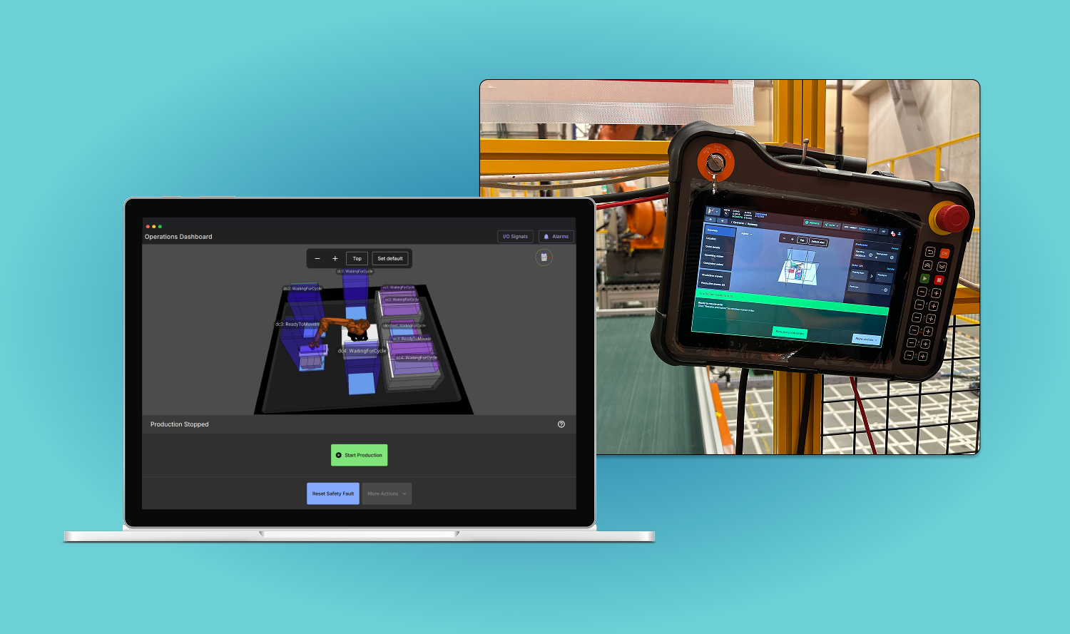
An operations interface had existed for managing a robot cell during production, but it was only available on a handheld pendant device situated at the physical cell and could not run natively on a browser remotely. The user experience was confusing because of all the features that had been accumulated over time. As a result, training new integration staff took a long time, reinforcing the reputation that it was an expert's tool.
The project goal was to design a new interface that non-technical operators could use to run production and eventually replace the existing version. It needed to work across devices (namely the handheld pendant, desktop and other HMI devices) and reduce the high cost associated with engineers providing direct support by improving usability and allowing greater customization.
There were many challenges that were largely due to the fact that more features and customer sites across global markets were continually being introduced with the existing interface in mind, making it hard to catch up. Increased complexity reinforced frustration around the seeming lag in progress and greater demand in terms of scope. We were starting from the difficult place of mistrust and poorly defined requirements, with a lot of expectation to deliver fast and have feature parity.
As the main designer with three developers as a core team, I started by gathering information to get the lay of the land. We did not have a dedicated product manager, so I helped define requirements by writing a product requirements document and managed stakeholders throughout the process. To overcome key challenges, I focused on several strategies: (1) more engagement with Japan-based stakeholders and gaining firsthand experience of integrating and operating a robot cell to build trust; (2) prioritizing the features that would serve as the strongest foundation and add immediate new value not offered by the existing interface; (3) utilizing a newly migrated design system to make the interface stand out and improve consistency, efficiency, and alignment with industry colours.
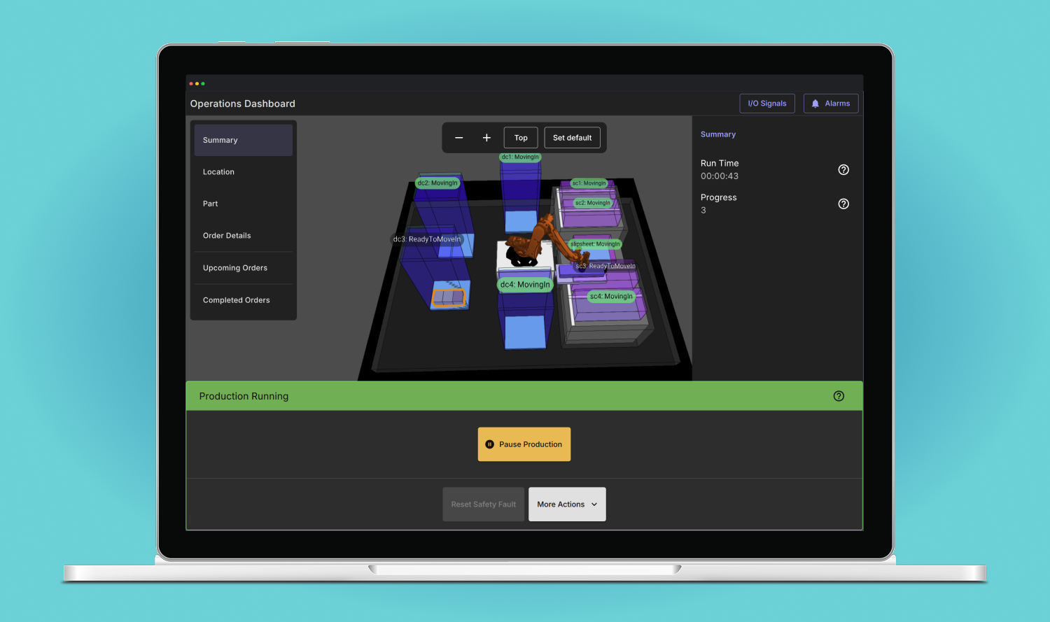
I had the opportunity to visit a factory to observe operators being trained. They rarely looked at the interface when production was running. But when something went wrong, it became a high stress moment, and that's when the user experience needed clearer guidance. That changed one of my initial assumptions — that the emphasis of the UI be on data display. Instead, it needed to be on clear operator control. That's why the final design incorporated a large panel on the bottom of the UI using high contrast colours to indicate system changes: green when production was running and red when attention was required.

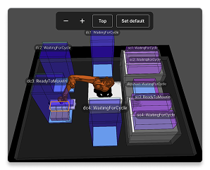
Another notable design decision was placing the digital twin as the main backdrop as opposed to prioritizing a text-based view. This was based on the understanding that the digital twin was one of the main value drivers of the system and provided a visual connection to the real world that other competing systems didn't have. Even though it was important to display data about status and order details, it was placed around the digital twin to minimize context switching.
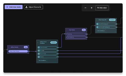
One of the less visible but core learnings was about the project process before the interface even became relevant. Project managers often used static flow charts to discuss changes to the robot recovery flow with customers as part of their requirements gathering. Robot recovery was a critical component because it was the most high pressure part of an operator's interaction with the robot. These were then passed on to system integrators and engineers to customize on the UI. This led to a key decision to prioritize designing and developing a no-code recovery flow customization capability as a key feature above others. It would look and feel similar to the flow charts already used to increase adoption. The final design used React Flow to create an interactive flow chart experience that started with a standard template that could be adapted.
When the first version of the operations interface was released, it marked a significant new product offering that was made available across all customer sites. No longer did operators need to rely on the existing UI, and there was a new foundation to build on top of. It was just the beginning and a second major release followed with the no-code recovery feature. To increase adoption, I assisted with live demo sessions with system integrators and gathered feedback to prioritize for subsequent releases. The customizable recovery flow gained the most excitement with existing experts who were able to visually see the process at a glance (and make tweaks) for the first time without looking at the code. It was immediately deployed on a large project in Japan.