Teaching | 2019-2021
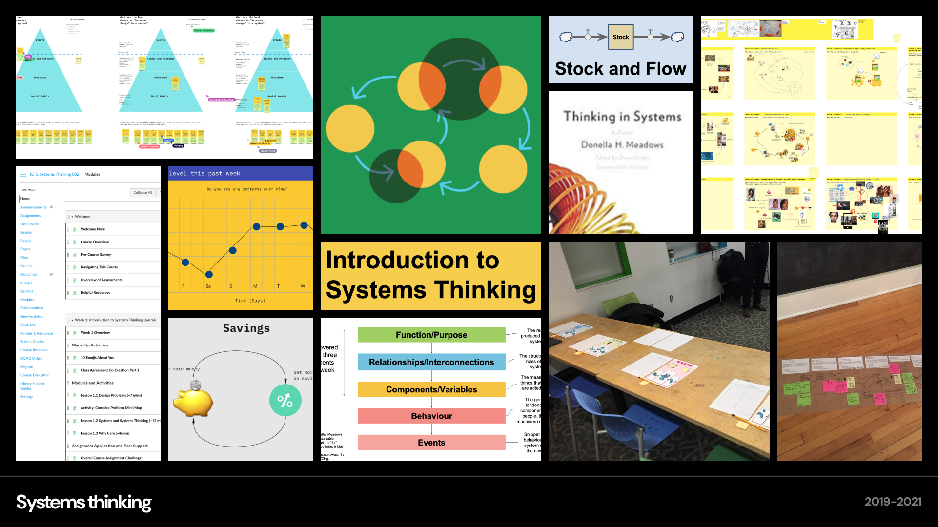
Systems thinking is a way of investigating how things are interrelated and part of a whole, encompassing concepts, mindsets, tools, and methods for analyzing complex problems. For three terms, I taught a course on Systems Thinking at OCAD University. I developed the course curriculum to introduce concepts and tools for applying a systems approach to complex problems. It was a 12 week course (3 hours each) with about 25 students. I iterated on the course each year and prepared a fully virtual version during the covid pandemic, making adjustments to ensure that students who were remote and in different time zones could still participate. I broke down content into smaller sections and adapted to new digital tools for collaboration. The course received positive feedback from students and other instructors.
Design and development | May-Nov 2020
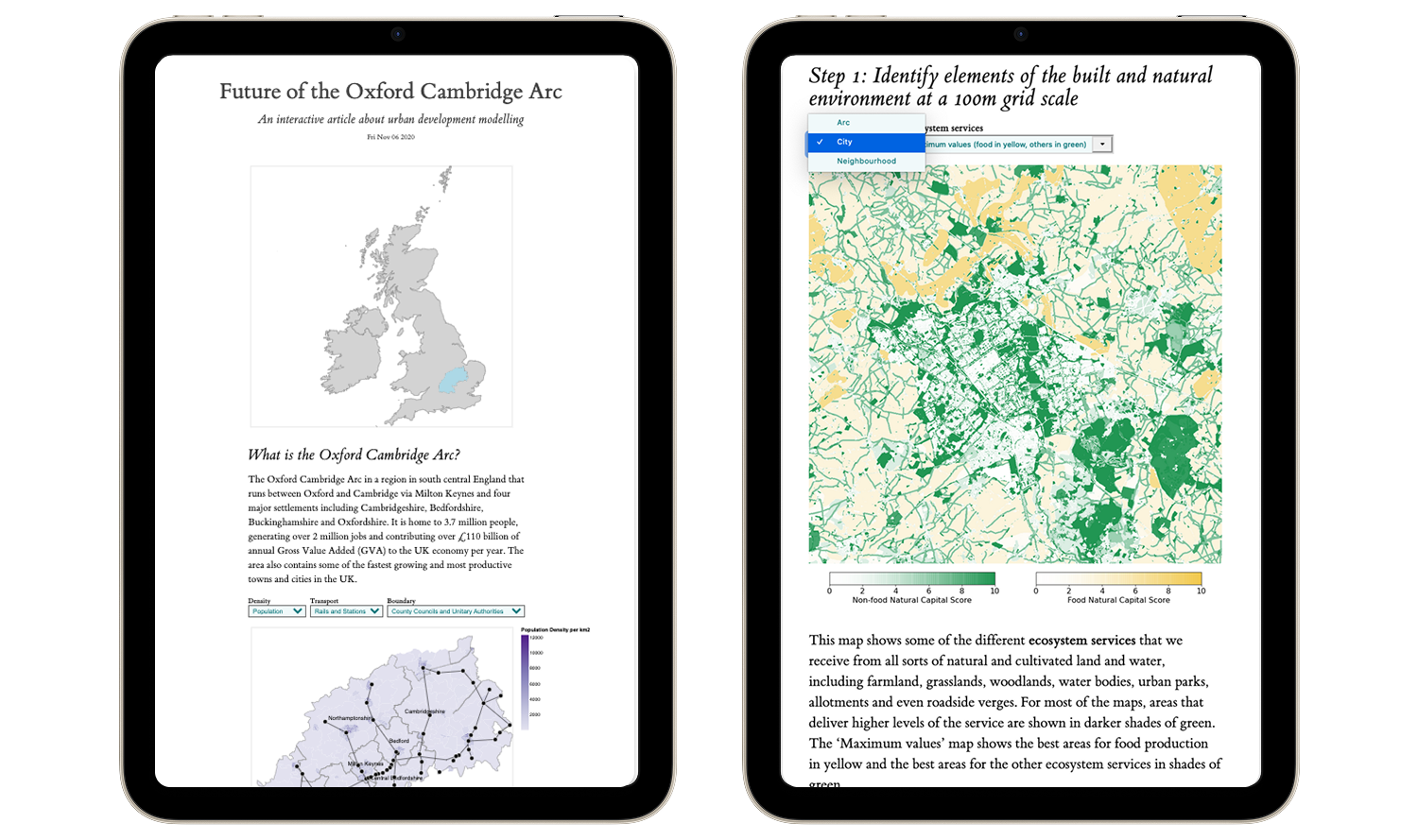
A consortium of UK universities developed the world’s first national infrastructure system-of-systems modelling software used to simulate infrastructure change. To apply the model in real life, one of the projects focused on a region known as the Oxford Cambridge Arc in the UK because it contained some of the fastest growing towns and cities. The government had released plans to include 1 million new homes by 2050, a new expressway road, and additional rail routes. The team working on this project had almost finished their analysis work and was looking to share the modelling process and early outputs in a visual way beyond a traditional white paper. I was contracted by the University of Oxford to create a visualization. I proposed a format inspired by explorable explanations, which are a way of communicating ideas by allowing readers to be active participants in the process through interactivity. I drafted a story outline and evolved it from low-to-high fidelity mockups. I was also responsible for the implementation. The final article was published in Feb 2021 here: Future of the Oxford Cambridge Arc.
Visual design consultant | 2018
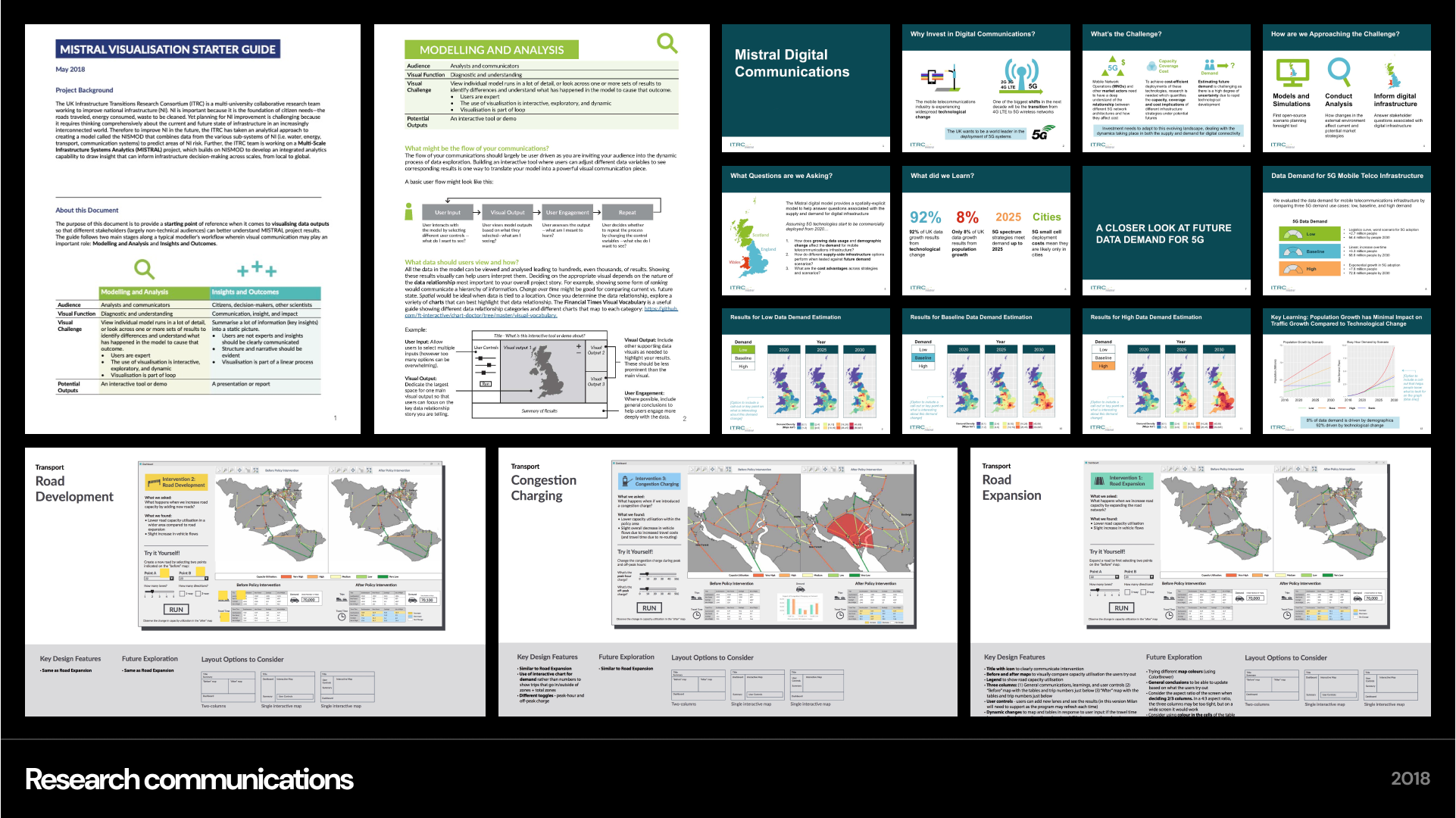
With the goal of improving national infrastructure, a consortium of leading UK universities built a comprehensive system of computer models to predict how infrastructures systems like water, energy, transport, and communication would need to change in order to adapt to an increasingly interconnected world. As a visual design consultant, my goal was to support two data modelers in translating their key study learnings into communications for non-technical audiences (i.e. policy makers) during a live showcase/demo. I worked 1:1 with each data modeler to identify ways to showcase their work based on their current progress. For instance, I worked with a transport modeler on an interface using their GIS software to highlight key insights from their white paper. I worked with a digital communications modeler to translate white paper findings into a presentation. As a leave-behind, I created a visualization starter guide with basic visual communication takeaway for the team. Both modelers were able to share about their individual progress in a way that appealed to non-experts at the showcase event.
Masters research | May-September 2015
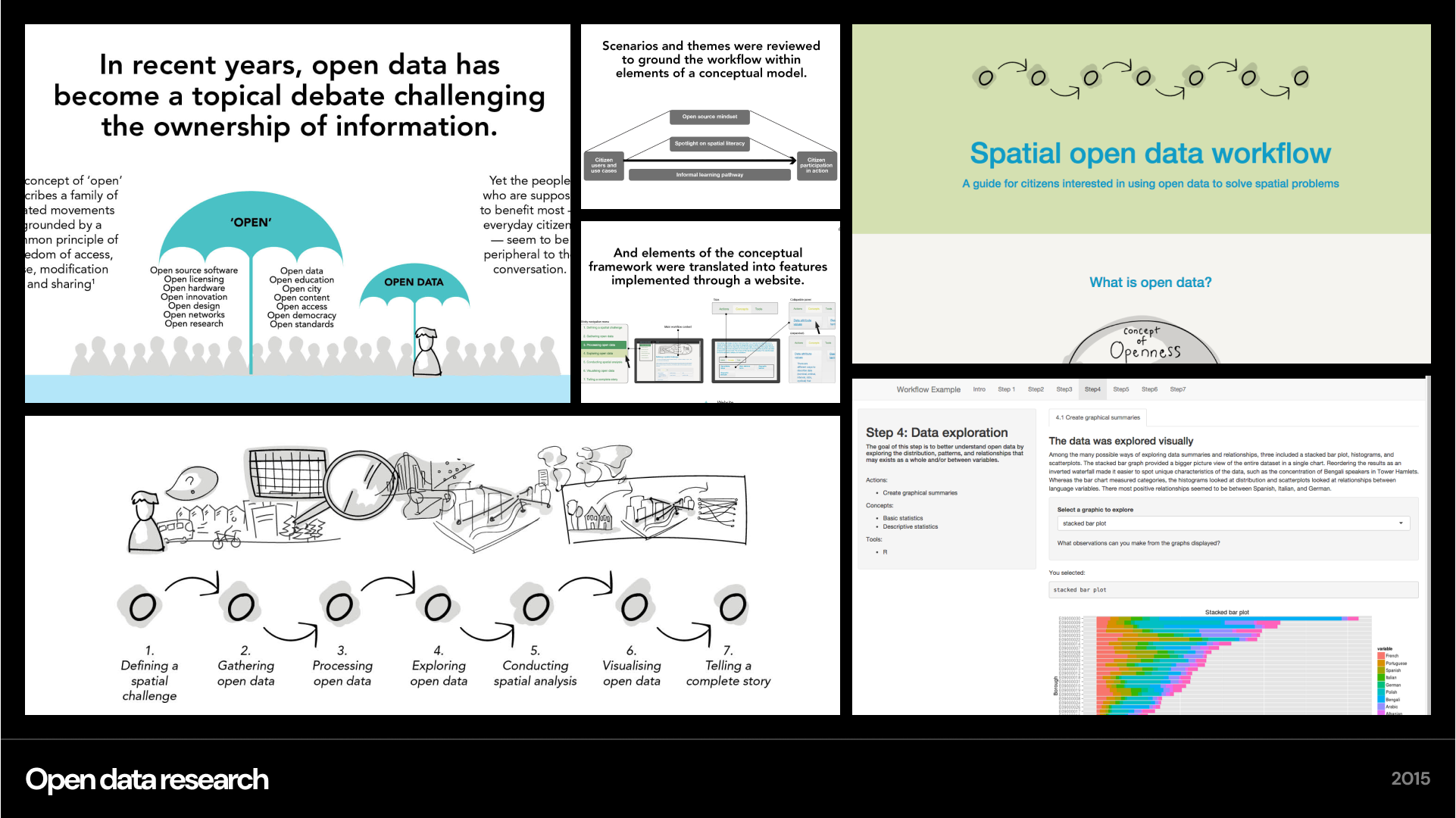
For citizens, open data can be used to learn more about local issues, such as government spending or the water quality of a nearby lake. Yet challenges remain when it comes to everyday people using open data to its full potential. On a practical level, data isn’t always user-friendly or intuitive to work with. It requires a basic level of technical, statistical, and visual skills to make sense of. My masters research project was to uncover key learning gaps people have when it comes to using open data in a meaningful way by developing and evaluating a spatial open data workflow. As a prototype to evaluate the workflow, I investigated language diversity in London boroughs using open data, and followed the spatial open data workflow to compare how languages were distributed.
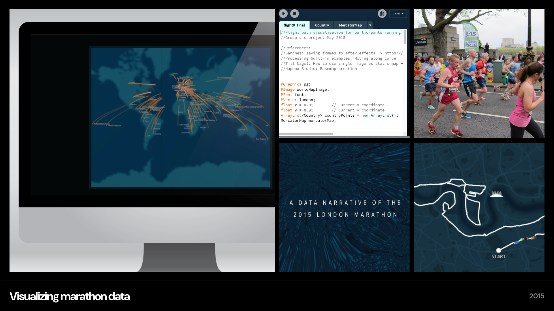
Group visualization project | Feb - May 2015
The London Marathon is a world major marathon that attracts over 35,000 participants from over 100 countries every year. In 2015, there were 37,652 participants from 106 different countries with 89% of the runners from the UK. As part of a digital visualization project at UCL, I collaborated with a group of three students to create a web-based visualization showcasing the day-in-the-life of marathon runners. We set out to tell the story of participant arrival and racing using 2D and 3D medium, with the goal of exploring a variety of visualization techniques as one story. My technical contribution was a 2D visual showing the arrival of participants from around the world using Processing. I also combined everyone’s visualizations into the final cohesive video using AfterEffects. Watch the video here: visual marathon